Task and challenge
The BOCAR Group is a globally active company based in Mexico – with German DNA. BOCAR focuses on the development and production of aluminum and plastic components for the most demanding customer requirements. BOCAR’s customers include the world’s most important automobile manufacturers.
Against this background and the global transformation in the automotive industry, we were commissioned to develop a clear brand identity and brand positioning, a convincing brand architecture and a modern and sustainable corporate identity for BOCAR and all its subsidiaries. And a coherent communication concept for the global markets.
Project description and scope
As part of a 12-month, multi-stage process, we revised the vision and mission, brand architecture, positioning, corporate design, slogan, logo and figurative mark – for BOCAR as a brand overall and as an employer brand.
In detail:
Based on comprehensive internal and external analyses of the status quo using desk research and external market research, a dedicated inventory was carried out with strengths and weaknesses as well as the identification of potential for the BOCAR Group. Based on these as-is analyses, ambitious brand identities and positioning were derived with a view to the future challenges in the market, taking into account the roots of the brand. In various workshops with top management and the owner families – some of which were held on site in Mexico – the different perspectives were reconciled and a final concept was agreed.
Shortfacts
Sector / Products: Automotive industry, worldwide
Customer since: 2010
Measures taken:
Creation – fresher, clearer, more flexible.
Against the backdrop of the transformation of the automotive world, we were guided by the following thoughts:
• How do we make the change at BOCAR, the new culture and the new strategy visible?
• Do we think design primarily from the digital side (e.g. social, website)?
• How do we make the core values of “people, technologies, trust and expertise” visible in the design?
• How do we create a global, flexible, lively design that leaves room for the future and for different target groups – while at the same time maximizing recognition?
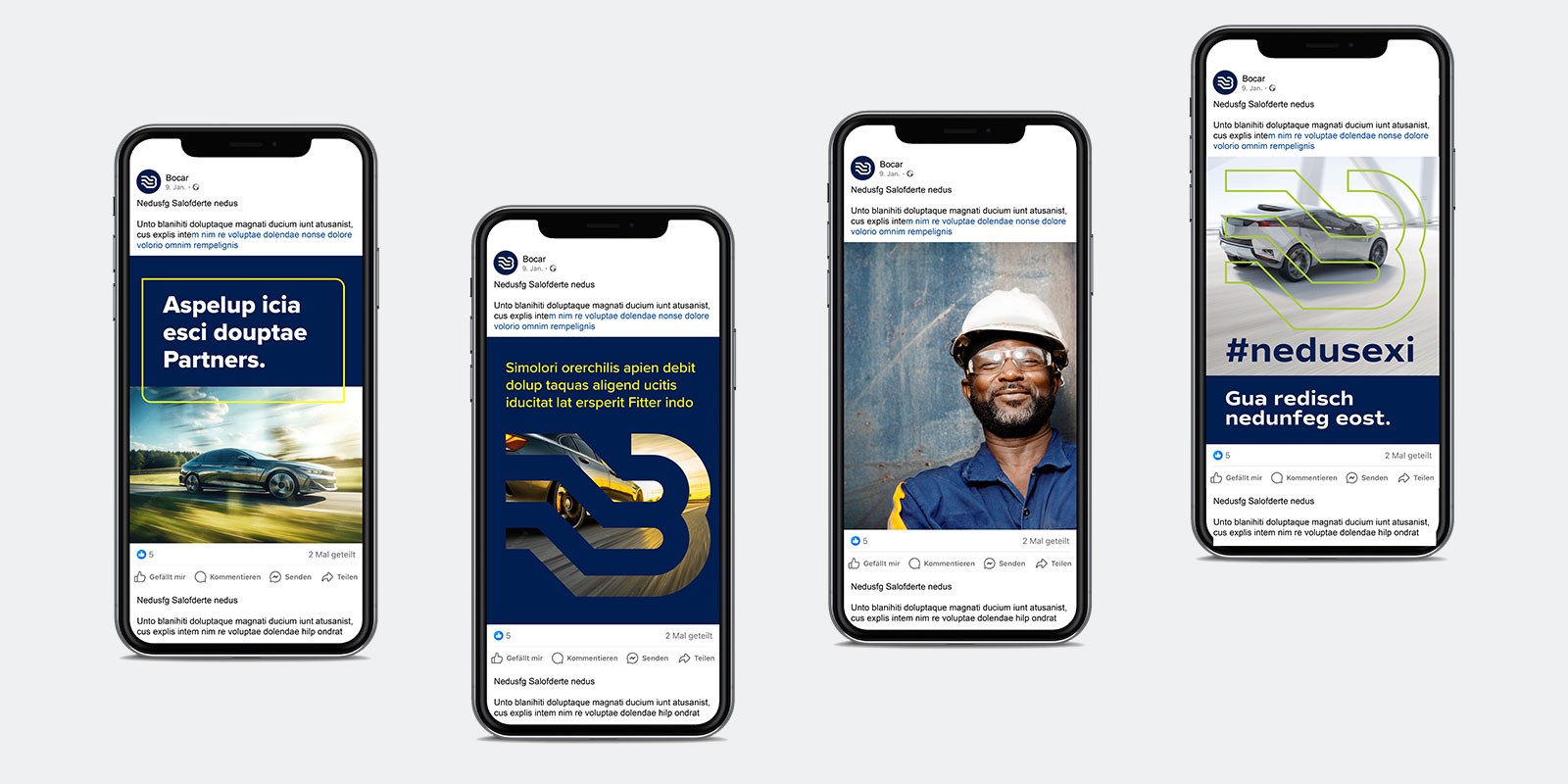
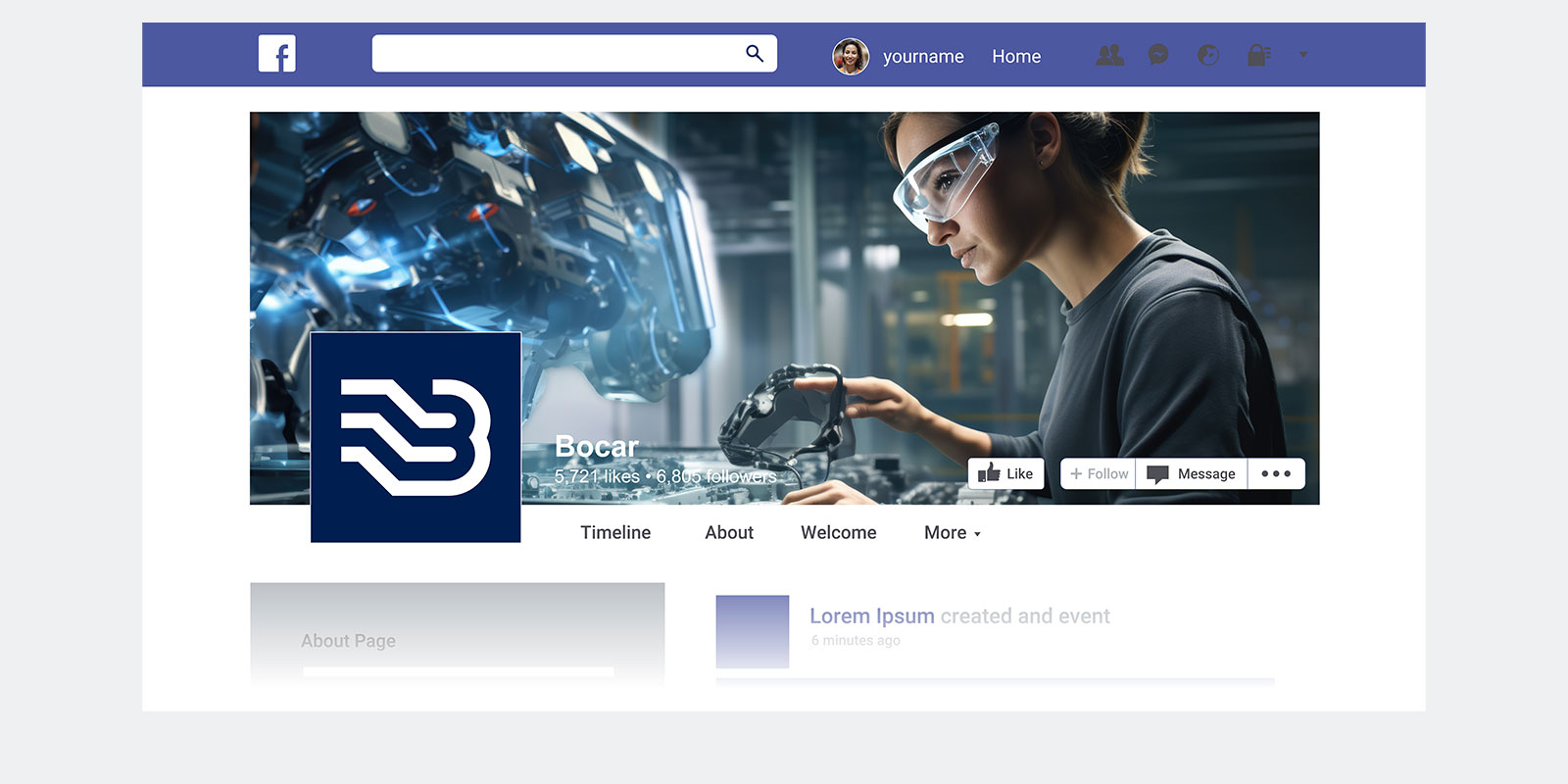
Logo and figurative mark
The relationship between logo and signet has been changed and made more flexible. The previous figurative mark “B” has been given more power and has become a “brand shaper” or central design element – similar to the Mercedes star. It can now also be used without the logo or lettering. Depending on requirements, in different colors, with a color gradient or with images.
Visual world
The employees are at the heart of the new image. They are the ones who make the difference and the success of BOCAR. Authentic images are therefore an important part of the communication. Depending on requirements, images of products, production or vehicles and nature are also included.
Tonality – Corporate Font
BOCAR is a strong and self-confident company. The new font therefore runs a little wider and appears less cluttered and crowded.
Brand architecture – One strong global brand.
In future, the new brand architecture will unite all companies, brands and products under the BOCAR corporate brand. The names BOCAR Group will only be used in the content area. Individual companies will continue as legal entities, but no longer as separate brands in the external image.
This form of brand architecture is easy to manage, requires comparatively little effort and creates identification. In addition, BOCAR can now present itself to customers, employees and other stakeholders with a uniform name. This strengthens the global brand and creates maximum recognition.
Core message
The new central message to all stakeholders is “Your reliable partner.” The statement can be supplemented depending on the application. FOR EXAMPLE:
Your reliable partner – for strategic thinking.
Your reliable partner – for a sustainable future.
Your reliable partner – for future-proof jobs.
World of color – “Life is colorful”
BOCAR stands for cutting-edge technology – developed and produced by people with diverse and varied backgrounds and different needs and wishes.
With this in mind, we have refreshed BOCAR’s color scheme and added “warm” colors – each matching the theme, such as technology, sustainability or HR. Colorful and diverse, instead of cold and monochrome.
“Winner for BOCAR Brand Creation & Design in the category Excellence in Brand Strategy and Creation – Brand Design – Corporate Brand”